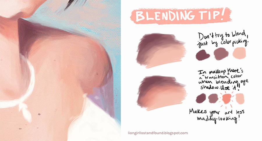
Lo and behold, the first bit of art advice I’ve ever posted to the internet! This blending tip was quickly tossed together almost 3 years ago when my brother asked my sister and me for help with digital art. With all of the rounds it’s made on social media, I decided it was about time I address all of the questions and comments that have come up in one place.
Before I get into it, I want to clarify that this doesn’t only apply to painting skin. At the time I made it, I was working on a portrait for my friend’s birthday and used the colors in the painting to illustrate what I meant. It happened to be the colors I used for her skin, but you can apply this wherever you see fit!
Blending Tip For Digital Painting
If you want to make your art less muddy looking, don’t try to blend just by color picking. Introduce a “transition” color like makeup artists use to blend eyeshadow. Your transition color should be of equal or more saturation as the color you’re transitioning into for it to liven up your art.
Here’s a step-by-step explanation of how you can choose transition colors:
- Pick a color that you’re trying to transition into with the eyedropper tool (in this case, I picked the light skin tone)
- Make the color equally or more saturated
- Shift the hue ever-so-slightly (in this case, I moved towards red)
- Make the transition color lighter or darker, whichever makes sense for the colors you’re using. (I chose the light skin tone to base my transition color on, so I made the transition color darker to blend into the shadow tone)
It’s all up to you how different the transition color should be, and it’ll take some experimenting, so don’t feel bad if you don’t get it the first time around.
Quick tip: if you don’t like working with the hue cube, consider using the HSB (hue, saturation, brightness) sliders instead. It can make choosing colors easier because you’ll be able to gauge your choices based on numerical values. For example, you can be sure that your saturation percentage has stayed within the range you’re aiming for (equal or greater).
That still might be confusing for you, and that’s okay! For this blending tip to be helpful, I think you need a good basis of color theory. It’s something I want to make posts on in the future, but in the meantime, this video from Marco Bucci explains some important and interesting things about color. (Yes, it’s talking about skin tones again but the information about color is pretty general too, I promise.) Consider checking out the other videos he has about color on his channel too— he’s a killer teacher.
Color is hard. It’s so relative to the colors around it that you can be so sure you’ve picked out the perfect color and then in practice, it doesn’t work at all. So play around with your color picker until you feel you’ve found the right one. It really is about feeling with color.
Why does it work?
One of the comments I’ve received most is that this is an example of subsurface scattering, which is very true! If you’re not sure what that is, you can learn a good deal about it in this Schoolism video from Sam Nielson. (I first learned about it from James Gurney’s Color and Light, so you can also read about it there and on his blog here.)
However, this being due to subsurface scattering is only in the context of my painting. This is ‘true’ for objects that aren’t even a little translucent like skin is. Paul Foxton at Learning to See has a post about 'the Chroma Curve’ that explains it wonderfully. Since I’ll only talk a little bit about the concept here, read his full post to get a better understanding.
Let’s take a look at Paul’s breakdown of a solid sphere that’s been painted orange. (For our purposes, chroma and saturation are treated as the same thing but they’re technically not so… no pitchforks please.) You can see that the colors between the lightest and darkest shades of the sphere are more saturated than them, forming the ‘chroma curve.’
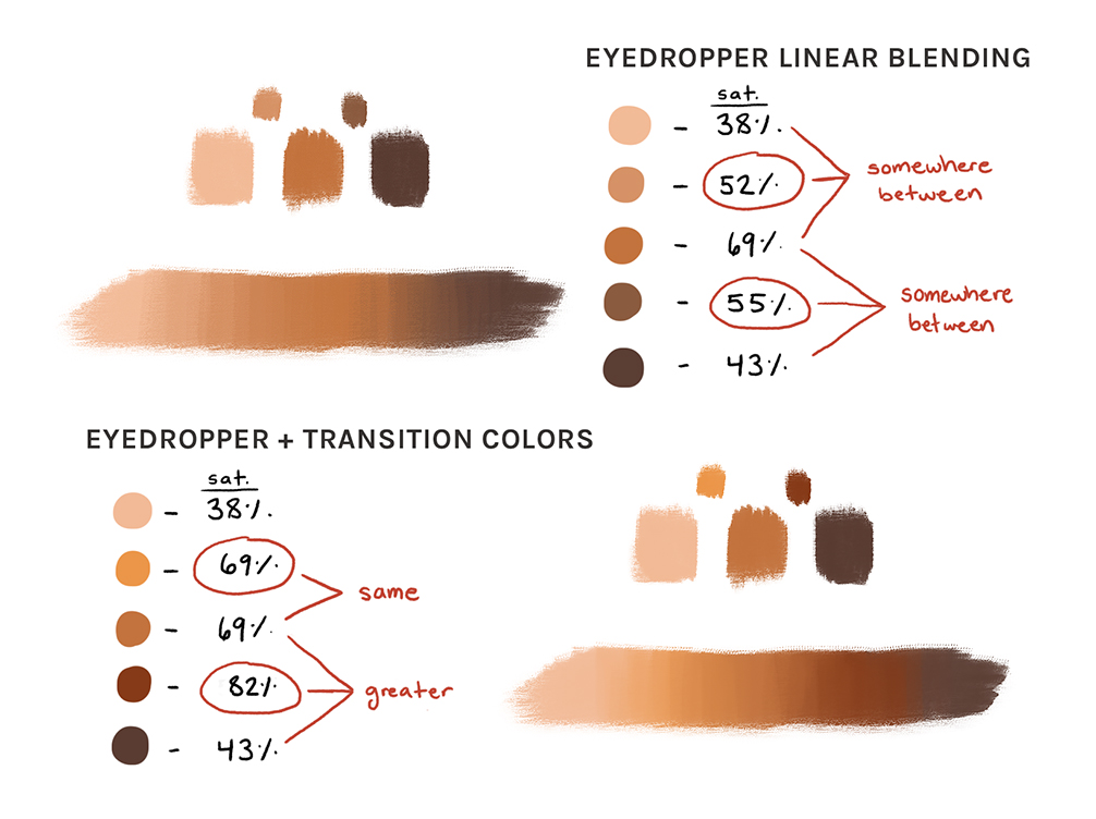
From a digital art perspective, the problem with using the eyedropper to blend between colors is that it’ll linearly blend the colors, averaging them out each time. I’ll use the same colors from Paul’s sphere to explain what I mean.
When you blend between two colors with the eyedropper tool, it’s giving you a literal ‘in-between’ color, so the saturation is always going to be between the two shades you’re blending. That’s when digital painting starts to look artificial, computer-generated, and muddy. It’s lacking the subtleties in color that your eyes perceive in real life, so just by introducing transition colors with equal or greater saturation, it seems to have more life. Shifting the hue a bit can add even more nuances.
Overall, I think this tip speaks more to trying to capture the spirit of something in order to strike relatability and realism in the viewer’s eyes rather than capturing something note-for-note. Here’s an excerpt from Andrew Loomis’ Creative Illustration about using a transition color on the edge of shadows:
 |
| The Chroma Curve: How to Paint Light and Shadow from Learning to See |
Let’s take a look at Paul’s breakdown of a solid sphere that’s been painted orange. (For our purposes, chroma and saturation are treated as the same thing but they’re technically not so… no pitchforks please.) You can see that the colors between the lightest and darkest shades of the sphere are more saturated than them, forming the ‘chroma curve.’
From a digital art perspective, the problem with using the eyedropper to blend between colors is that it’ll linearly blend the colors, averaging them out each time. I’ll use the same colors from Paul’s sphere to explain what I mean.
When you blend between two colors with the eyedropper tool, it’s giving you a literal ‘in-between’ color, so the saturation is always going to be between the two shades you’re blending. That’s when digital painting starts to look artificial, computer-generated, and muddy. It’s lacking the subtleties in color that your eyes perceive in real life, so just by introducing transition colors with equal or greater saturation, it seems to have more life. Shifting the hue a bit can add even more nuances.
Overall, I think this tip speaks more to trying to capture the spirit of something in order to strike relatability and realism in the viewer’s eyes rather than capturing something note-for-note. Here’s an excerpt from Andrew Loomis’ Creative Illustration about using a transition color on the edge of shadows:
 |
| Left half: "Showing how brilliancy may be added by intensifying the color on the edge of the light area next to the shadow." Right half: "Showing how different [it looks] when the halftone is made [a] brighter color rather than by simply mixing the color in the light with the color in the shadow to make the halftone. We cannot 'just rub' the light and shadow together and produce anything but dull color. But somehow most of us still do it." - Andrew Loomis, Creative Illustration |
Using the eyedropper tool to find your halftone/midtone really is basically ‘just rubbing’ the colors together. Of course, if it makes more sense for your illustration to have dull colors, then by all means, use dull colors. It’s always your choice to decide if art advice and rules align with your goals.
And please, never belittle someone who’s trying to learn. Under one repost of my blending tip, a person commented that this tip is easier to understand than the specifics of subsurface scattering, and someone else replied something to the effect of ‘if you’re an artist who doesn’t know what subsurface scattering is then I don’t know what to say except you’ve failed.’ I don’t normally address things like this, but that kind of gatekeeping is why people give up learning new things. Education’s not that accessible, even with the internet at [some of] our fingertips. We’re all just trying to improve at our own pace, and that should always be celebrated, not ridiculed.
A final note on learning: I applied a makeup tip to digital painting because all art forms aren’t as different and disconnected as they may seem. If you’re trying to learn concept art, consider learning a thing about photography. Or if you’re a writer, animator, or designer dealing heavily with characters, you might read up on acting. There’s tons you can apply from other fields, even those outside of the arts, to your practices.
I initially shared this tip because I wanted to prove to myself that I had something to offer, and it turned out I did. Now I just hope this post can act as an amendment for anyone who needs more information. And I’m sure you can expect even more amendments to the advice I post, since there’s always more to learn!
The blog is on hiatus until I can get into a consistent posting rhythm, but I’ve got exciting content planned and I’m always open to suggestions. Feel free to get in touch via the comments below, Twitter, Instagram, or good ‘ol email!
Links included in this post:
- Marco Bucci's Character Design Mini-Series pt. 2 - Value, Light, Flesh, Color (starts at 11:12)
- Schoolism's the Four Main Types of Subsurface Scattering video
- Subsurface Scattering I by James Gurney
- The Chroma Curve: How to Paint Light and Shadow from Learning to See
Books mentioned in this post:
- Color and Light: A Guide for the Realist Painter by James Gurney
- Creative Illustration by Andrew Loomis (free to read on Archive.org!)


tysm for the tips!!!!
ReplyDeleteThis comment has been removed by the author.
ReplyDeleteSuch a deep tips I got from you about blending, Kiara. Thanks a lot for sharing these tips with all of us. Looking forward to reading more from you.
ReplyDeleteThis color is very nice.
ReplyDeleteCar photo editing
This post made me see things from a different perspective. Thank you!
ReplyDeleteVisit Here: Photo Color Correction Service
How is SEO different for Irish businesses compared to other regions? digital marketing ireland
ReplyDelete